This was sent to me by a reader.
If unable to read the entire note now, come back to it later, but leave with this bottom line:
As we pointed out four weeks ago, if our natural gas usage this winter is instead similar to that of 2014, our natural gas supplies could fall to below 200 billion cubic feet by the end of the heating season, implying widespread natural gas shortages and much higher prices….I have "pasted" the entire note with no editing or re-formatting.
It's a very, very long note, but incredibly worth the read.
From a reader.
Minimal editing but re-formatted to some extent. Any errors are mine.
Disclaimer: in a long note like this there will be factual and typographical errors. They will be corrected when found. Facts and opinions are commingled on the blog. It is often difficult to separate fact from opinion on the blog.
Disclaimer: this is for educational purposes only. Do not make any financial, investment, travel, job, or relationship decisions based on what you read here or what you think you may have read here.
Now, from the reader:
This is a bit longer than I could squeeze down to blog comment size.
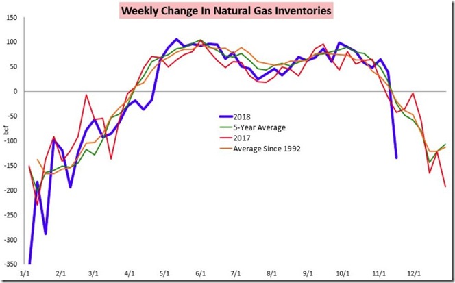
Lasst week's draw was a real outlier....the first graph below tells the story...
The natural gas storage report for the week ending November 16th from the EIA showed that natural gas in storage in the US fell by 134 billion cubic feet to 3,113 billion cubic feet over the week, which left our gas supplies 620 billion cubic feet, or 16.6% below the 3,733 billion cubic feet that were in storage on November 17th of last year, and 710 billion cubic feet, or 18.6% below the five-year average of 3,823 billion cubic feet of natural gas that are typically in storage on the third weekend of November ...
This week’s 134 billion cubic feet withdrawal from US natural gas supplies was quite a bit more than the 92 to 121 billion cubic feet withdrawal that analysts had been expecting, and way more than the average of 25 billion cubic feet of natural gas that have been withdrawn from storage during the second full week of November in recent years, as it was the largest withdrawal this early in the heating season in history; in fact, many years have not seen a natural gas withdrawal that large for the entire month of November....
Natural gas storage facilities in the Midwest saw a 32 billion cubic feet drop in supplies over the week, which increased the region’s gas supply deficit to 12.0% below normal, and natural gas supplies in the East also fell by 32 billion cubic feet as their supply deficit rose to 11.7% below normal for this time of year…
Meanwhile, the South Central region saw a 55 billion cubic feet drop in their supplies, as their natural gas storage deficit jumped to 26.8% below their five-year average for the third weekend of November…at the same time, 8 billion cubic feet were pulled out of natural gas supplies in the Pacific region as their deficit from normal rose to 27.2%, while 7 billion cubic feet were withdrawn from storage in the Mountain region, where their natural gas supply deficit rose to 20.2% below normal for this time of year….
Compared to other mid November low storage readings, this week’s 3,113 billion cubic feet of natural gas in storage was 13.4% lower than the previous 5 year low of 3,594 billion cubic feet that was set on November 14th of 2014, 10.8% below the 10 year low of 3,488 billion cubic feet that was hit on November 14th of 2008, 4.9% below the 3,274 billion cubic feet of natural gas we had in storage on November 18th of 2005, and 1.3% below the 3155 billion cubic feet that were in storage to start the winter on November 14th of 2003…we have to go back 16 years, to November 15th 2002, when 3,096 billion cubic feet of natural gas were in storage, to find a lower quantity of natural gas in storage in mid-November than now….
For a visualization of what this week’s natural gas withdrawal looks like historically, we have a graphic showing this year’s weekly change in natural gas inventories as compared to last year’s and to the long term averages:

The above graph was copied from a blog post at Bespoke Weather that was published on Wednesday of this week, shortly after the early release of the natural gas storage report…
On this graph, purple shows this year’s weekly additions to natural gas storage in billions of cubic feet above the zero line, and this year’s weekly withdrawals from natural gas storage in billions of cubic feet below the zero line; similarly, weekly additions and withdrawals of natural gas in 2017 are shown in red, the 5 year average weekly change of natural gas in storage is shown in green, and the historical average weekly change of natural gas supplies in EIA data going back to 1992 is shown in orange…
At the far left, you can see the record withdrawal of 359 billion of cubic feet that used 11.5% of all the natural gas we had on hand during the first week in January of this year, and a withdrawal of 288 billion cubic feet during the third week of January that would have also been a record withdrawal if not for the first week; those 2 big withdrawals thus dropped our natural gas supplies to 17.5% below normal to start the year…the cold April further reduced supplies vis a vis normal, as you can see that the averages show we should have been adding to supplies at that time of year….
Through most of the summer, our additions to storage were fairly close the normal range, but by then the stage had already been set for natural gas supplies to be at a 15 year low to start this winter…
To see what kind of temperature factors caused this week’s large withdrawal, and what kind of temperatures will be influencing next week’s natural gas supply report, we’ll next look at the most recent average temperature summary from the EIA’s natural gas storage dashboard:

The above graphic from the EIA’s natural gas storage dashboard gives us both the average daily temperature from November 9th thru November 22nd in each of the five natural gas regions, as well as a color-coded variance from normal for each of those daily temperature averages, with shades of brown indicating the average temperatures in the region were above normal on a given date, while shades of blue indicate average temperatures that were below normal for the date, as indicated in the legend at the bottom….thus this graphic gives us not only the actual average temperature for each region for each day, but also indicates how much that temperature deviated from the norm…
As you can see, temperatures for every region except for the 3 Pacific states were below normal through the week ending November 16th, with both the Midwest and South Central regions, encompassing the large expanse in the middle of the country, between 15 and 19 degrees below normal on three separate days in the period…
The following week, which will be reported on next week, looks a bit warmer, but not by much, as if you look at the lower line on the graphic you’ll see national average temperature only rose from an average of around 42 degrees during the week ending November 16th to around 44 degrees in the week after that, which means we can expect another large withdrawal this coming week, as consumption of natural gas for heating continues apace…
While average temperatures as shown above give us a general idea of the heating requirements over a given period, their relationship is inexact because they don’t differentiate between broad sparsely populated regions of the country where heating demand might be minimal even if it is cold, and the larger cities where a cold snap would result in a large burn of natural gas for heat…
Moreover, an average temperature for a region like the East above, which includes all the states from Maine to Florida, tells us little about what parts of that region are seeing the heating demand corresponding to the average temperatures….
For a better measure of heating demand, utilities and suppliers of heating fuels use a metric called heating degree days to determine what the daily demand for heating will be, so they can adjust their production or delivery schedules accordingly…those degree days are computed by taking the average daily temperature for a location and subtracting that number from 65 degrees, which is considered to be the temperature when most buildings will start to need heating…
Hence, the colder it gets, the higher the degree day factor becomes, and hence it’s a effective measure of heating demand…
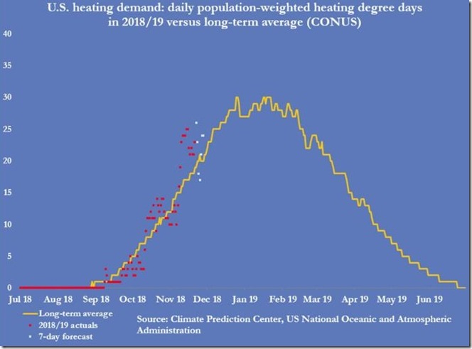
Thus this next graphic, which shows us population weighted heating demand for the entire country, is much more useful in determining the ultimate consumption of natural gas…

The above graph came from a Thursday email titled “Best in Energy” that John Kemp, senior energy analyst and columnist with Reuters, sends out free daily, on request…
In this graphic, the yellow graph shows the average degree days that have been needed per capita each day over the typical US heating season (starting with zero in July), while the red dots indicate the actual population weighted degree days for each day of the 2018-2019 heating season…
In addition, the graph also includes 7 white dots which are a forecast of population weighted degree days that will determine heating requirements for the next 7 days…John did not indicate the exact date for this graph, but since the first white dot shows a large spike, i’m guessing that would probably be for Thanksgiving day, when New York city and most of the Northeast saw their coldest Thanksgiving in 150 years…
Thus the red dots would represent the days prior to November 21st, with all the recent ones clustered roughly between 20 and 25 degree days per capita nationally, indicating heating requirements that would normally be more typical of mid-December…
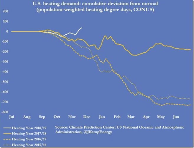
The next graph, also from that John Kemp emailing, shows the cumulative heating degree day deviation from normal, up to and including this reporting week…

In this graph, the divergence of cumulative heating degree days from normal for this year and for each of the previous three heating seasons is shown daily, with the current year shown as a solid white line, with last year’s divergence shown as a solid yellow line, with the divergence from normal for the 2016/2017 heating season shown as a dashed yellow line, and with the divergence from normal of the 2015/2016 heating season shown as a dotted yellow line…
Note that the graphs for all three prior years trend downward, or negative from zero, because all three years experienced warmer than normal temperatures, and hence less degree days than normal…
However, after a warmish October, when this year’s heating requirements were also below normal, the white line for 2018-19 has now moved upwards into positive territory, meaning this year’s cumulative heating requirements are now running above normal…
The broader takeaway from this graph, though, is that the natural gas demand we saw over the past three years is not a good benchmark for what we’ll need this year, because those years were warmer than normal, with the heating needs of both 2015/2016 and 2016/2017 roughly 17% below normal…
As we pointed out four weeks ago, if our natural gas usage this winter is instead similar to that of 2014, our natural gas supplies could fall to below 200 billion cubic feet by the end of the heating season, implying widespread natural gas shortages and much higher prices….