Re-posting from yesterday, but now the last two observations and the question no one has answered much less asked.
********************
What's Causing All The Deaths?
From the CDC -- which "we" no longer trust.
Note:
in a note like this, I will make some typographical and some content
errors, which will be corrected as I find them, but I think intelligent
folks can sort out (and mentally correct) these errors.
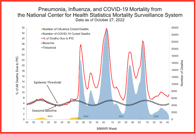
This graph is updated every week by the CDC. The chart starts in week 40 of whatever year the CDC chooses to start because that's when the "flu season" begins.
These are deaths from all "chest colds." It doesn't matter what: viral, bacterial, fungal. All respiratory deaths. "Seasonal flu," Covid, pneumococcal, tuberculosis, whatever.
Let's walk through the graph.
This is the per cent of all US deaths caused by "chest colds."
Or chest infections, if you prefer, short term (acute) or long term (chronic).
Red line: percent of all deaths in the US due to chest infections that week at that point in time.
"Yellow
lump" at bottom of graph: "seasonal flu." The number of all deaths due
to "seasonal flu." Not percent -- that comes later -- buy the raw number
of deaths (see y-axis at the right).
The seasonal
baseline for "seasonal flu" was running about 5% and the "epidemic
threshold" was just slightly above that. It didn't/doesn't take much for
the CDC to declare a seasonal flu epidemic. Maybe that's why folks like
me didn't get excited about Covid at first. An example of the CDC
crying "wolf" too many times? Every year the CDC said we were on the
verge of a seasonal flu epidemic.
So, in 2019, before Covid, the worst "seasonal flu" did was be
responsible for less about 5% of all deaths in the US -- the others being
cancer, heart disease, homicide, vehicular accidents, suicide,
unprovoked attack by a unicorn. About 5%.
Move to late 2019 -- week 50 and into early 2020 -- through week 5.
We still had that "yellow lump" (see above -- nothing changed).
But look at the red line.
The red line: deaths from all causes, trending trending toward 30 percent of all deaths in the US were from "chest colds," or chest infections. Had that been due to smallpox ... well, think about that for a moment.
That's what Dr Fauci, et al, were seeing. In 1920 we had just lived through the same thing, but no one knew the cause. In 2020, we knew the cause and it quickly became politicized. To my chagrin and embarrassment I fell into the politicization.
The blue shaded area is deaths from Covid-19. Some will argue the data was fake in 2020, that's fine. But by 2021, this was no longer fake. If you feel otherwise, quit reading.
So,
- the red line: before Covid, about 5% of all deaths in the US were due to chest colds;
- by early 2020 -- in just a couple of weeks, upwards of 30% of all deaths in the US were due to chest colds.
Now, there are two more data points / observations I want to make. But I will give you some time to see what you observe with regard to 2022. And one of the observations was noted as early as 2021.
The two most interesting observations lead to one question, which I cannot answer and no one else has even asked.First: go to the far right side of the graph. Note that the "blue shaded area," the number of Covid-19 coded deaths continues to drop. However the percent of deaths due to chest colds, the red line, is turning up, indicating a rising number of deaths due to chest colds.
But note, and this is the second observation: there is still no "yellow lump." There are no deaths attributable to "seasonal flu" yet -- or not enough to show up on the chart.
So, if deaths from all sources of chest colds are increasing, and neither deaths from Covid-19 or "seasonal flu" are increasing, what's causing the number of deaths -- the red line -- to increase as indicated by the red line?
